As we embark on a new year, interior design enthusiasts and homeowners eagerly anticipate the latest color trends that will shape the aesthetic landscape of their living spaces. In 2024, three influential companies—Benjamin Moore, Pantone, and Etsy—have revealed their Colors of the Year, each offering a unique palette that captures the essence of the times. Let’s dive into these exciting choices and explore how they can inspire and elevate your interior decorating.
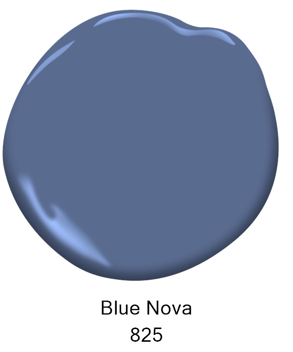
Benjamin Moore: „Blue Nova”
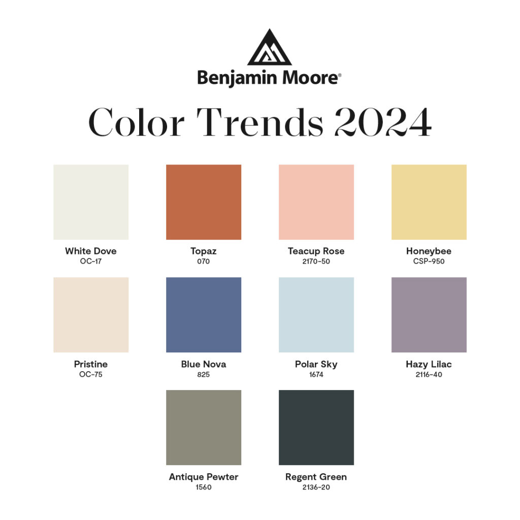
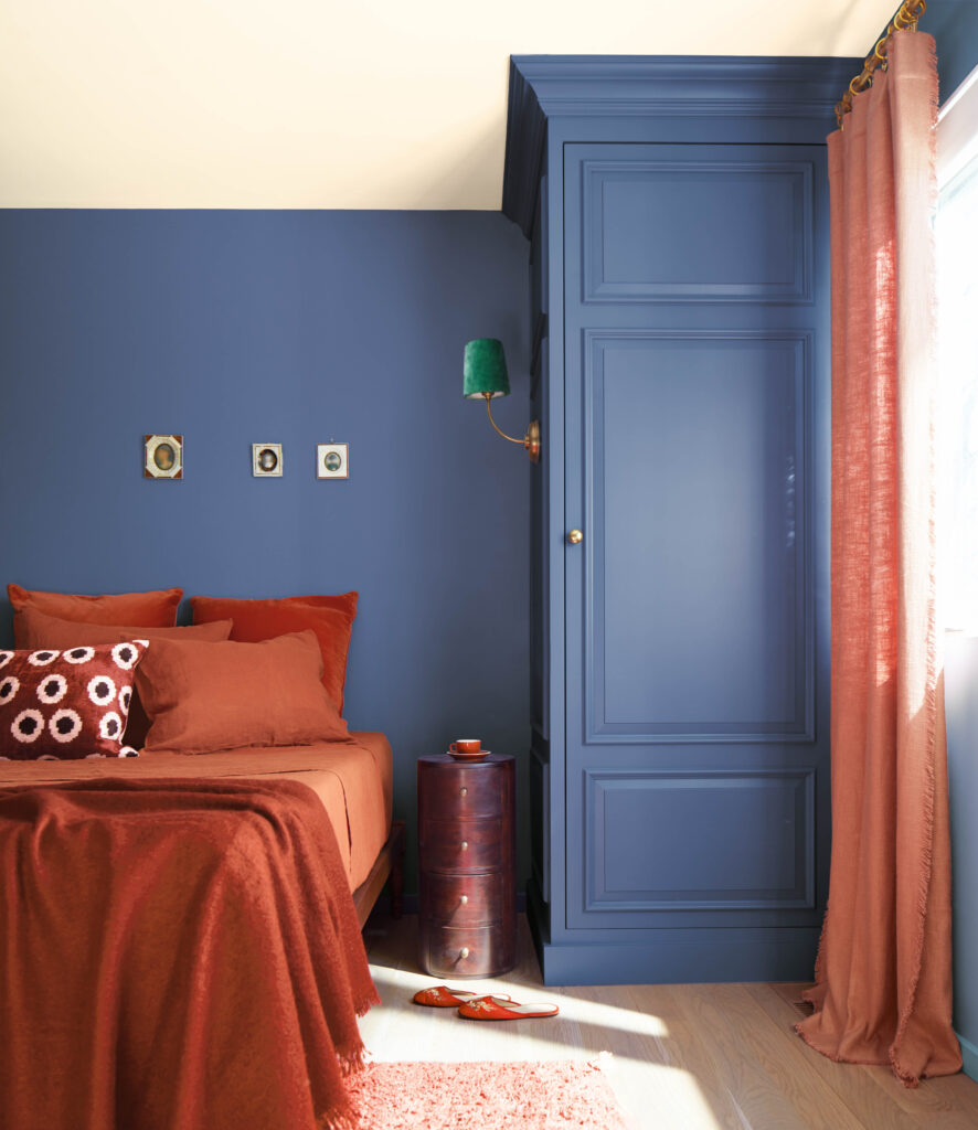
Benjamin Moore sets the tone for 2024 with „Blue Nova,” an alluring mid-tone that captures the spotlight with endlessly classic appeal. Balancing between blue and violet, this captivating shade brings a fresh and modern feel to the traditional and very popular blue palette. Whether used as an accent or as the primary color, for me „Blue Nova” invites exploration of the boundaries between classic and contemporary, offering a seamless blend that brings an intriguing feel into the traditional blue palette.
Playing with the whole color palette proposed by Benjamin Moore for 2024 would be joy as these are trendy, yet timeless muted shades that will work for years. Take “White Dove” and you will find that this has been one of the most popular and recommended wall paint by most of the interior designers for years.
Design tips
Complement this cosmic elegance with metallic accents, such as silver or chrome, and consider using Benjamin Moore’s „Paper White,” „Mount Saint Anne” in gray-green, „Monterey White,” and „Quincy Tan” as matching colors for a well-balanced and visually engaging interior design. Experiment with textures like linen or velvet to add depth and tactile interest.
For more inspirations see BM website
Pantone: „Peach Fuzz”

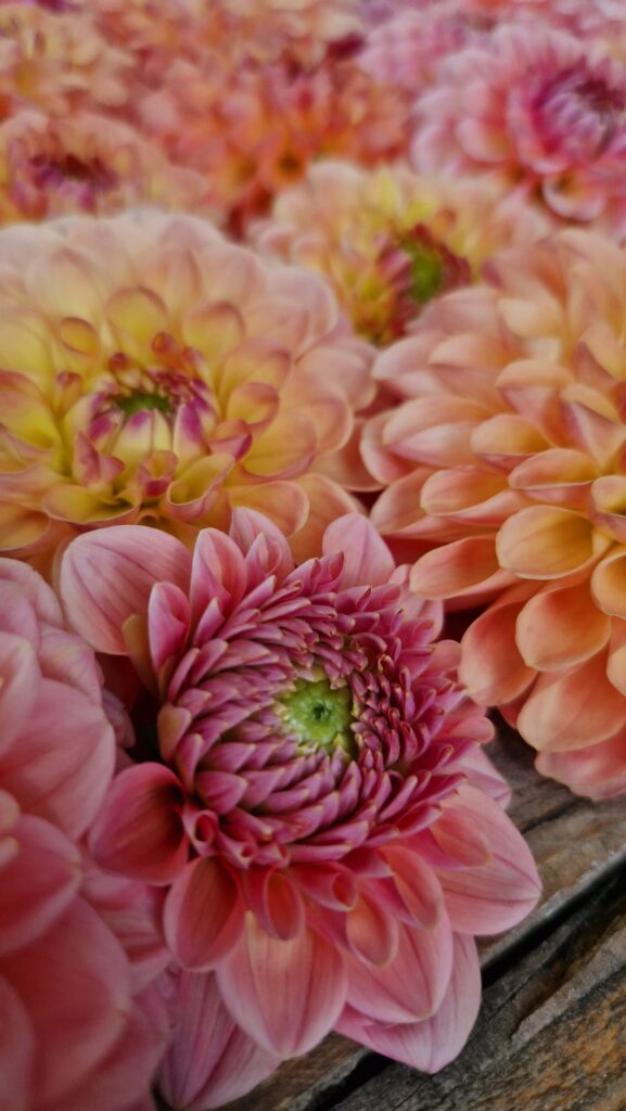
Pantone’s Color of the Year for 2024 is the soothing „Peach Fuzz,” a velvety and gentle peach tone that evokes warmth and serenity. This hue beautifully represents our collective need to be restored by the spaces and objects in our lives—interiors as a retreat, home decor as a conduit for comfort, and garments as a cocoon of calm.
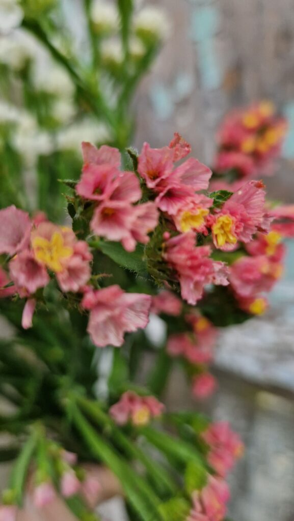
The enduring popularity of peach and apricot flowers in gardens, observed at events like the Chelsea Flower Show, further emphasizes the comforting qualities of peach tones. The wedding industry has appreciated this color palette for bouquets and flower arrangements for some years now. Isn’t it great that nature inspires us with such sweet tones? See the garden of Ania, the wonderful soul and get inspired to grow all sorts of peachy and apricot flowers in your garden.


Check her Instagram for more annuals to grow in your garden.
Design tips
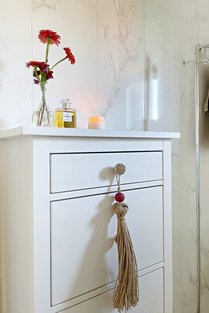
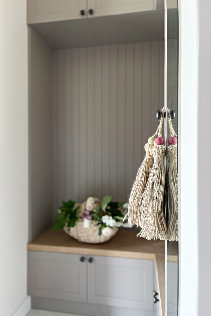
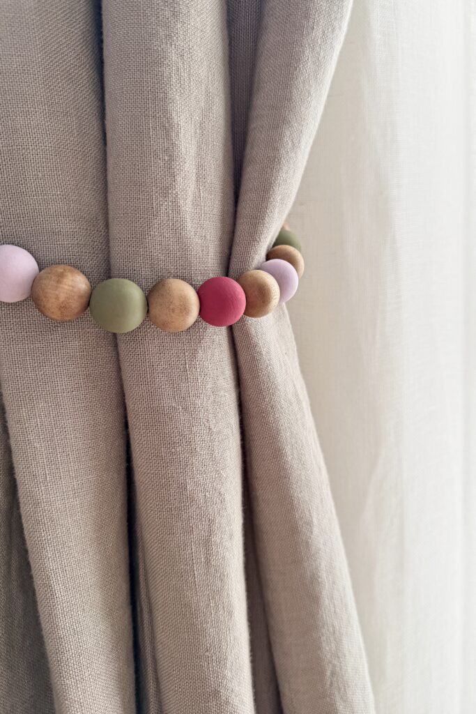
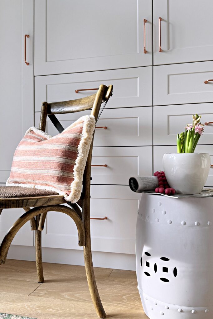
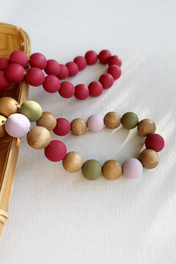
Imagine building your room around a foundation of Peach Fuzz wallpaper, creating a soft and inviting backdrop inspired by nature’s own palette. Enhance the ambiance with a hint of peach using a collection of throw pillows, bringing warmth and comfort to your living spaces. If you feel you need more time to feel comfortable with this shade, start with just as a small accent, for example in a mix of wooden beads curtain tiebacks as shown below.
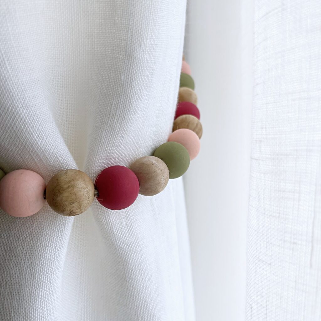
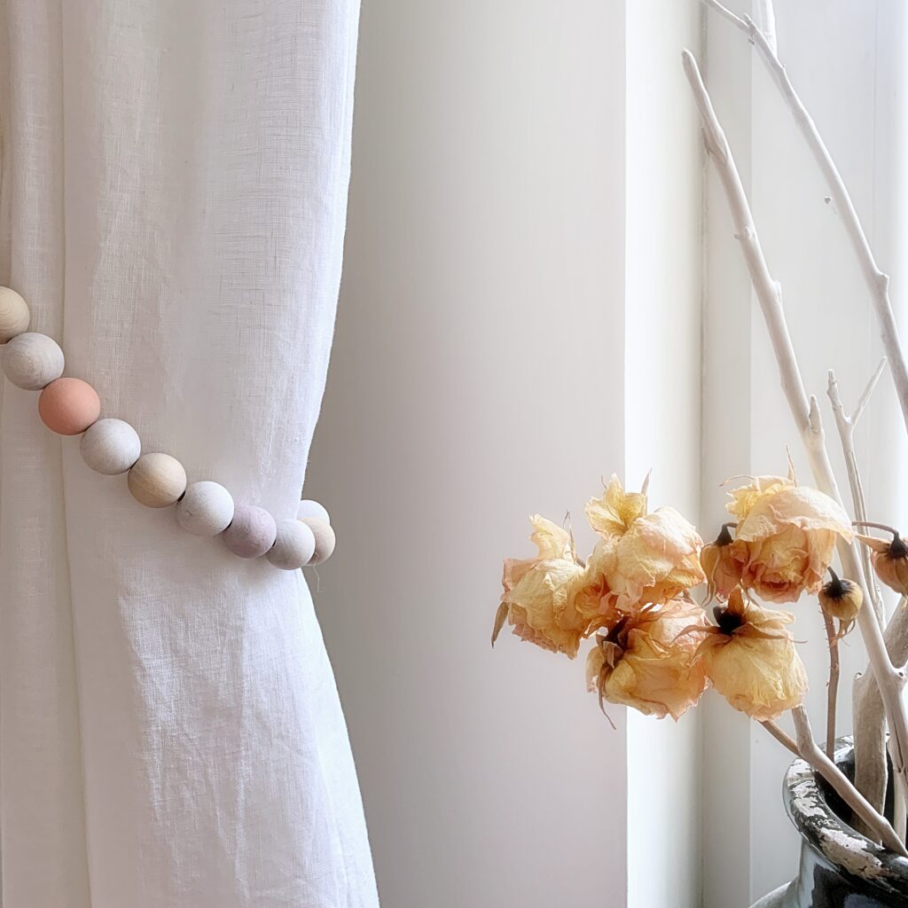
Credit: Creative Boutique Home
For more on Peach Fuzz see Pantone’s website.
Etsy: „Berry”
Etsy is a platform to sell the hand made products made by individuals with creative imagination and taste. Etsy’s Color of the Year for 2024 is the rich and inviting „Berry,” deemed a „relaxed and undeniably romantic” color. Inspired by the tomato girl summer and mermaidcore trends, Etsy predicts that the „growing trend of romanticizing life” will lead to an elevation in „life’s simple pleasures.”
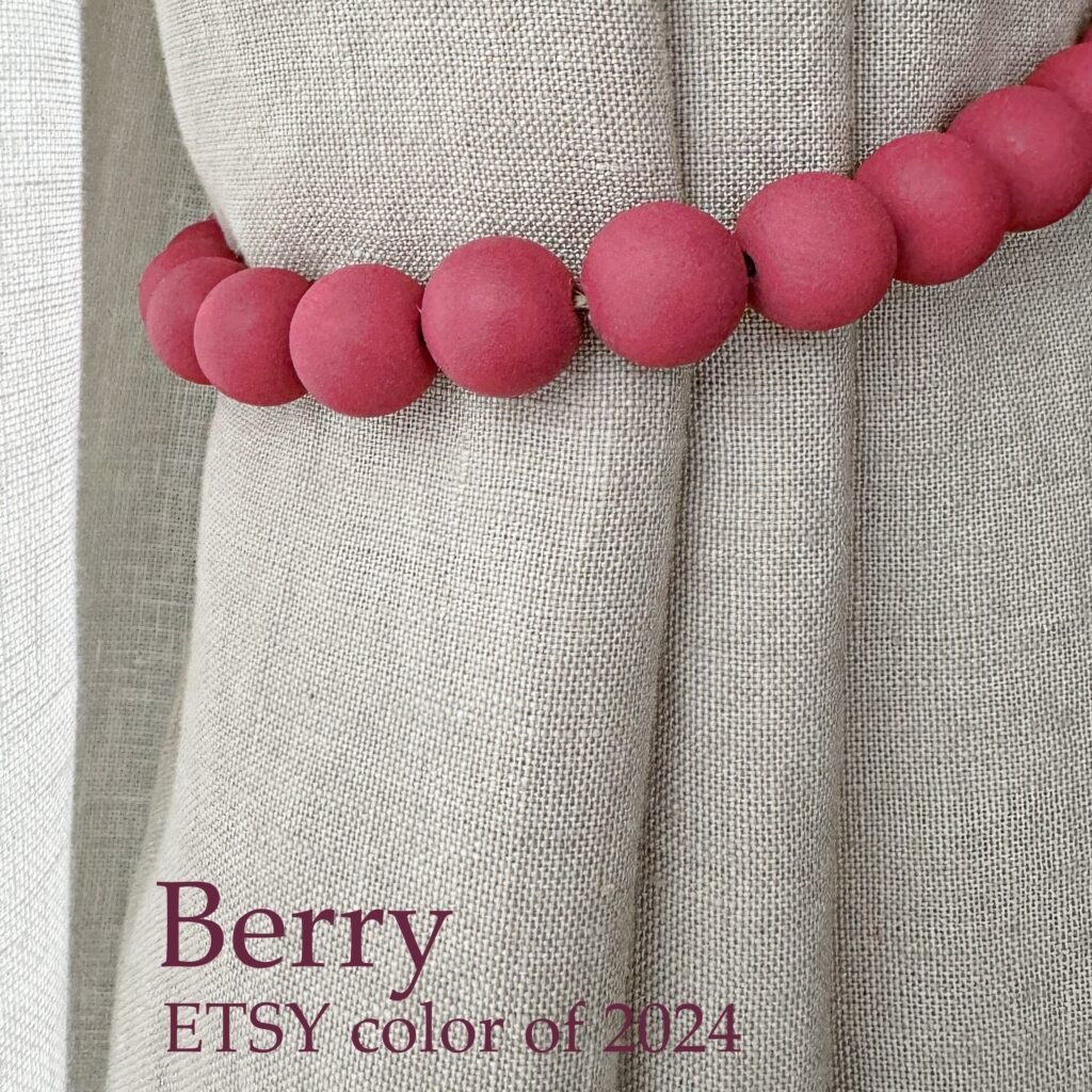
This versatile shade seamlessly blends deep reds and blue tones, making it ideal for decorative accents, accessories, and wallpaper. Since Berry is deemed a “relaxed and undeniably romantic” color compared to deep reds or softer pinks, Etsy’s choice is ideal for decorative accents, accessories, and wallpaper.
Design tips
Create a statement wall with „Berry” to infuse drama and personality into your space. Pair this rich hue with neutral tones like beige or charcoal to balance the vibrancy. Introduce decor elements in complementary shades, such as gold or brass, to enhance the overall luxurious feel. „Berry” isn’t just a color choice; it’s a manifestation of a broader lifestyle trend celebrating the beauty found in the ordinary and the romanticization of everyday experiences.
Credit: Creative Boutique Home
Now it is time to find out which one inspires you this year. Decorating is fun and joy, regardless whether it is interior or exterior space.